In January 2007, 26 minutes into his Macworld Expo keynote address, Steve Jobs introduced the iPhone with his justly-famous “three revolutionary products” framing:
This is a day I’ve been looking forward to for two-and-a-half years.
Every once in a while, a revolutionary product comes along that changes everything. … One’s very fortunate if you get to work on just one of these in your career.
Apple’s been very fortunate. It’s been able to introduce a few of these into the world. In 1984, we introduced the Macintosh. It didn’t just change Apple, it changed the whole computer industry. In 2001, we introduced the first iPod, and it didn’t just change the way we all listen to music, it changed the entire music industry.
Well, today, we’re introducing three revolutionary products of this class.
The first one is a widescreen iPod with touch controls.
The second is a revolutionary mobile phone.
And the third is a breakthrough Internet communications device.
So, three things: a widescreen iPod with touch controls; a revolutionary mobile phone; and a breakthrough Internet communications device. An iPod, a phone, and an Internet communicator. An iPod, a phone … are you getting it?
These are not three separate devices, this is one device, and we are calling it iPhone.
Ten years ago today, the iPhone went on sale.
I almost never watch an Apple keynote event after it has faded from being new. But I’ve watched the iPhone introduction at least half a dozen times over the years. I still get excited. The words Jobs used, as quoted above, are perfect. But you really have to watch it, to listen to his voice, to feel his conviction. He knew then what we all know now: this was it. This was the keynote we had all been waiting for. This was the reason why people lined up overnight for Apple keynotes — in the hopes of an announcement like this one. The iPhone was the product Apple had been founded to create — the epitome of everything both of Apple’s founding Steves stood for and obsessed about. The home run of all home runs.
With hindsight, though, I think even Jobs himself underestimated what the iPhone was.
The Apple I, the Apple II, the Macintosh, the iPod — yes, these were all industry-changing products. The iPhone never would have happened without each of them. But the iPhone wasn’t merely industry-changing. It wasn’t merely multi-industry-changing. It wasn’t merely many-industry-changing.
The iPhone changed the world.
There is no way to overstate it. The iPhone was the inflection point where “personal computing” truly became personal. Apple had amazing product introductions before the iPhone, and it’s had a few good ones after. But the iPhone was the only product introduction I’ve ever experienced that felt impossible. Apple couldn’t have shrunk Mac OS X — a Unix-based workstation OS, including the Cocoa frameworks — to a point where it could run on a cell phone. Scrolling couldn’t be that smooth and fluid. A touchscreen — especially one in a phone — couldn’t be so responsive. Apple couldn’t possibly have gotten a major carrier to cede them control over every aspect of the device, both hardware and software. I can recall sitting in the hall at Moscone West, watching the keynote unfold, 90 percent excited as hell, 10 percent concerned that I was losing my goddamn mind. Literally mind-blowing.
For nearly six interminable months we waited. And then even once I had my own iPhone in my hands on the evening of Friday, 29 June 2007, I kept thinking, I can’t believe this.
The iPhone’s potential was obviously deep, but it was so deep as to be unfathomable at the time. The original iPhone didn’t even shoot video; today the iPhone and iPhone-like Android phones have largely killed the point-and-shoot camera industry. It has obviated portable music players, audio recorders, paper maps, GPS devices, flashlights, walkie-talkies, music radio (with streaming music), talk radio (with podcasts), and more. Ride-sharing services like Uber and Lyft wouldn’t even make sense pre-iPhone. Social media is mobile-first, and in some cases mobile-only. More people read Daring Fireball on iPhones than on desktop computers.
In just a handful of years, Nokia and BlackBerry, both seemingly impregnable in 2006, were utterly obliterated. The makers of ever-more-computer-like gadgets were simply unable to compete with ever-more-gadget-like computers.
Ten years in and the full potential of the iPhone still hasn’t been fully tapped. No product in the computing age compares to the iPhone in terms of societal or financial impact. Few products in the history of the world compare. We may never see anything like it again — from Apple or from anyone else.
It was a little under a year ago that I declared Twitter back, baby on this blog. In that time, NewsBlur users have created over 80,000 Twitter feeds in NewsBlur. Since it’s such a popular feature, I decided to dive back into the code and make tweets look a whole lot better.

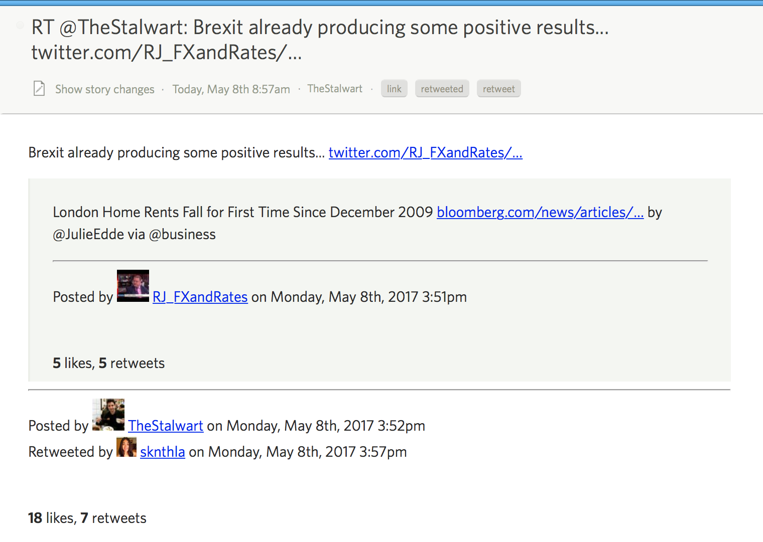
Notice that NewsBlur now natively supports expanding truncated URLs (no more t.co links).
And NewsBlur also supports native quoted tweets, where a user links to a tweet in their own tweet. NewsBlur expands the quoted tweet and blockquotes it for convenience.
Plus retweets now show both the original tweet author and the retweeting author. This means that you can quickly scan tweets and see where the retweet originated from. And retweeted tweets that quote their own tweets also get expanded.

It’s almost as if NewsBlur is inching closer and closer to becoming its own full fledged Twitter client. While NewsBlur already hit Zawinski’s Law (“Every program attempts to expand until it can read mail. Those programs which cannot so expand are replaced by ones which can.”) by supporting email-newsletters-to-rss, Twitter is coming up fast.
Speaking of which, I have this idea I’ve been noodling about better supporting Twitter habits that need to become less of a habit. I want to be able to automatically follow people from my Twitter tweetstream in NewsBlur based the frequency of their posting. I want to be able to infrequently dip into Twitter but still read the tweets from people who only post once a week or once a day.
In other words, I want Twitter, the RSS killer, to better integrate with an RSS reader so that I can pull out the good stuff from the unending flow of tweets. RSS means never missing anything, but Twitter’s main use case is anathema to how we use RSS. I don’t like to preannounce features, but this one intrigues me and if you agree, please share this story to let me know or to give me feedback on how you would like to see NewsBlur be a better Twitter client.

Personally, I'd be happy with a twitter folder, with a "feed" for each follow. With a bit of thumbs-training (and a per-folder focus setting? or something) I'd probably never go back to twitter.com at all.
Holy geez, this is a whopper of a release. Version 5.0 of the NewsBlur iOS app has lots and lots of new features, fixes for some long standing issues, and major performance improvements for reading stories.
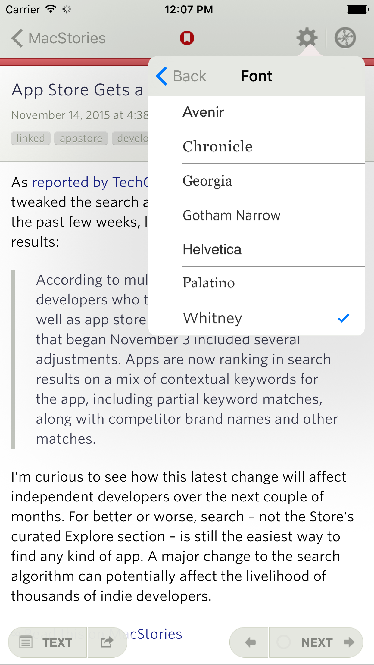
The biggest new feature to hit the iOS app is the introduction of premium fonts from type foundry Hoefler & Co. Whitney, Gotham Narrow, and Chronicle have been added to give NewsBlur a more pleasurable reading experience. Take a look for yourself.

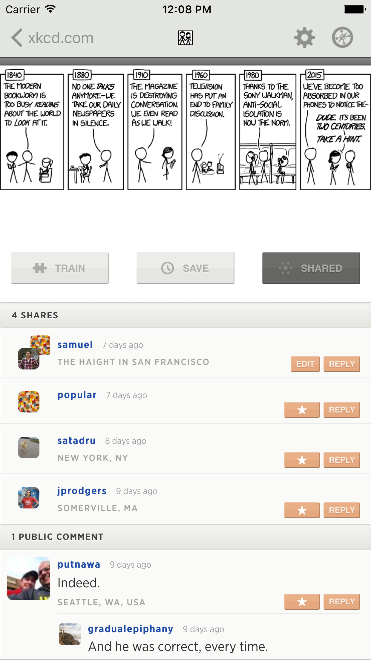
Comment-less shares have also been added to the iOS app. You can now share a story and your friends can now reply without you having to write anything first, just like on the web and on the Android app.

Here’s the full list of new features and improvements. Make a cup of tea first because this list is a doozy.
- The app has been iOS 9-ified.
- The iOS app now has the same great fonts from the web: Whitney, Gotham Narrow, and Chronicle. These each look fantastic.
- The Text view is now sticky based on the last view you used. It’s per feed but it also respects individual feeds when reading by folder. This is unlike the web, where the Text view matches the feed or folder. Now it’s sticky to the feed, which makes it much easier to read through a folder of stories.
- When switching between the Text view and Story view, the loading indicator is now at the bottom of the screen instead of directly on top of the story.
- Stories now remember your last scroll position. When you go back to a story, you are taken back to the same place you left off.
- New Safari-based browser for the original story. These views are faster and support content blockers on iOS 9 and use your browser’s cookies. However, they look like Safari and not NewsBlur, so the default in-app browser is the original browser. The new in-app Safari browser is a preference, along with Chrome, Opera, and the full Safari app.
- A new option to mark stories as read when they are scrolled past. Defaults to off.
- Sending stories to third-party services now uses full Text if available. Useful for storing full story text in Evernote or Pocket.
- Comment-less shares are now supported, allowing you to reply to shared stories that have no comment.
- The feed trainer now shows trained titles.
- 1Password integration on login.
- iPad Pro is now supported.
- Date and times of stories now uses the system locale, so everybody who isn’t in the U.S. will see dates as they should be.
- 3D Touch actions: Add site, all site stories, search stories.
- Voiceover support.
- iOS 8 is the minimum supported version for this release.
Hot dog that’s a lot in one release. Version 5.0 is now ready for you. Download it for free on the App Store.
Josh Topolsky:
The reality in media right now is that there is an enormous amount of noise. There are countless outlets (both old and new) vying for your attention, desperate not just to capture some audience, but all the audience. And in doing that, it feels like there’s a tremendous watering down of the quality and uniqueness of what is being made. Everything looks the same, reads the same, and seems to be competing for the same eyeballs. In both execution and content, I find myself increasingly frustrated with the rat race for maximum audience at any expense. It’s cynical and it’s cyclical — which makes for an exhausting and frankly boring experience.
I think people want something better, something more meaningful. Something a lot less noisy.
Sounds good to me.

Canadian rock band Nickelback has scrapped its tour after lead singer Chad Kroeger was diagnosed with an operable cyst on his "voice box," the band announces.